 F4LUFTBILDER
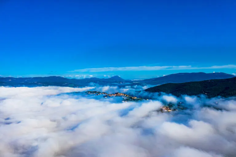





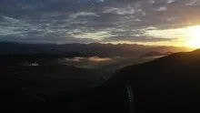
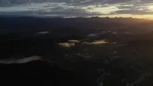

Tuscany above a sea of clouds
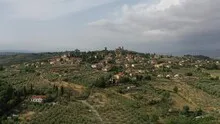
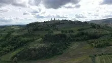
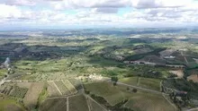
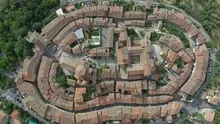
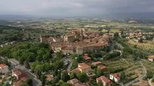
The Tuscany series shows, among other things, a place whose roofs rise from a low-lying layer of clouds. As a result, parts of the hilly area disappear, while individual hilltops emerge like islands. A second image with a clear view can explain the spatial relationships beneath the fog.
If only the peaks remain visible
Above the clouds of Tuscany, individual heights initially look like islands. Roofs or a piece of slope help to classify the outstanding shapes as parts of a coherent landscape.
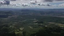
When haze or clouds weaken the distance, the closer landscape stands out all the more. Colors and contrasts change with distance. For a calm landscape portrait, this may be exactly what you want. When it comes to the spatial assignment of a specific motif, at least one prominent point should remain clearly recognizable. A caption can indicate the visibility conditions. It makes it understandable why part of the landscape is only hinted at and where the view can begin.
The graduation of the mountain ranges
The silhouette of a mountain range is a good way to start looking. First you notice the highest point, then the succession of saddles and flatter sections. In an oblique shot, this profile connects with the shapes in the foreground. A steeper perspective takes more interest in the surface of the slope. A direct comparison makes it understandable why a location can change significantly when the viewing angle changes, even though the recognizable heights in the background remain the same.
How the place changes from the inside out
A village view needs a comprehensible starting point. This can be an intersection, a prominent group of houses or the end of a street. From there, the paths to the outskirts of town can be more easily followed in the image. When publishing for readers from outside, a brief location information in the caption helps. Resident viewers are often interested in another level. They are looking for the location of a house, the route of their route to school or a familiar open space between buildings.
The distribution of blue tones
Among the 15 photos in the gallery, shot 9 and shot 6 provide a good starting point for the comparison. In the first excerpt, shades of blue play a smaller role. In the second shot, blue areas take up more space. Blue can extend over a large contiguous area or only appear in individual parts. What also counts for the effect is whether these areas extend to the edge of the picture or surround the main subject.
The camera captured September 30, 2020 for shot 1 and shot 15. The time interval between these two views is approximately 169 minutes. ISO 100 and an exposure time of 1/500 second are recorded for both files.
The Aerial Videos section supplements the photos with 13 clips. The aerial photographer's photographs linked there include “Tuscany from a bird's eye view”. The relevant video page on Adobe Stock can be opened using the respective preview.
Maintain the lighting mood in the selection
In strong backlight or great darkness, outlines often take over the task that colors and materials do during the day. An edit for publication should first be checked to see whether these outlines are retained. On a bright screen, dark areas can still appear finely graduated, converging in a small print. The later use is therefore practical information for the aerial photographer. A test printout or a view in the intended screen size says more than simply assessing a greatly enlarged file.
More aerial photos for comparison
Two further articles invite comparison. In the first, Italy – San Gimignano, a different detail is in the foreground. Above San Gimignano, the tall stone towers stand close to much lower roofs. Then you can choose Italy – Montecosaro. Montecosaro stands out as a long settlement in front of the green surroundings of the Marche.
Aerial photos of Tuscany
Your aerial photographer across Europe
Request a free quote